Vela
A calm, multi-currency banking app and identity for people whose lives don't fit inside one country.
- Client
- Vela
- Year
- 2025
- Industry
- Fintech
- Timeline
- 20 weeks
- Services
- Product designBrand identityDesign system
(01)The challenge
Vela's early app was powerful and exhausting: seven currencies, three account types and a dozen fees fighting for attention on a single screen. Customers loved the exchange rates and quietly left after their first transfer.
(02)Our approach
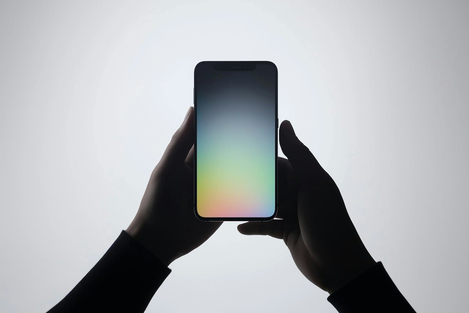
We rebuilt the product around one question, where is my money and what will it cost to move it, and answered it everywhere. A living balance view, fee previews before every action and an aurora-inspired identity that shifts color with each currency turned a spreadsheet into something people enjoy opening.
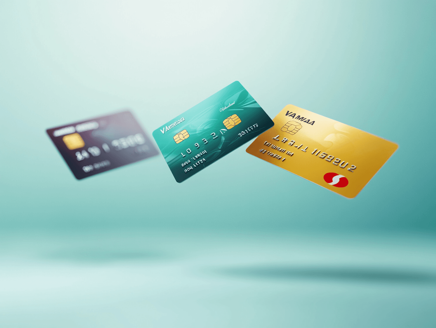
Fig. 01
Card explorations for the Aurora system: every currency gets its own hue, so you always know which balance you're spending from.
(03)Results
62%
Higher 90-day retention
4.8
Average app store rating
1.2M
Transfers in the first quarter after launch
They think like product people and ship like engineers. Our retention numbers are the proof, and our support queue has never been quieter.
Next case study
Helio